The Goods


Visit Carson City
Winter Wonderlands Aren’t Just for Hallmark Movies
peep it


ADSD
A State Agency Brand With a Human Touch
peep it


Outta the Box
Bold Ideas that Broke the Mold
peep it


Reno Tahoe
Pushing the Limits of a Travel Destination Website
peep it


Dairy Month
A Campaign that Makes You Say “Cowabunga, Dude!”
peep it


Splashtop
Finding the Right Remote Access Solution is Easy
peep it


Discover Kalamazoo
“See You in Kalamazoo?”
peep it


Recurly
New Paid Media Strategy—Who Dis?
peep it


PeopleGrove
Building Communities and Careers Out of Curiosity
peep it


Stellar
Powering a Universe of Financial Opportunity
peep it


Santa Maria Valley
Stimulus Checks, #SantaMariaStyle
peep it


Givelify
The Gift that Keeps on Giving
peep it


Nevada Dairy Farmers
Creating a Moovement
peep it


Nevada Secretary of State
We Don't Phone It In, But We Mail It In
peep it


Wedding Capital of the World
Inspiring a Rush to the Altar
peep it

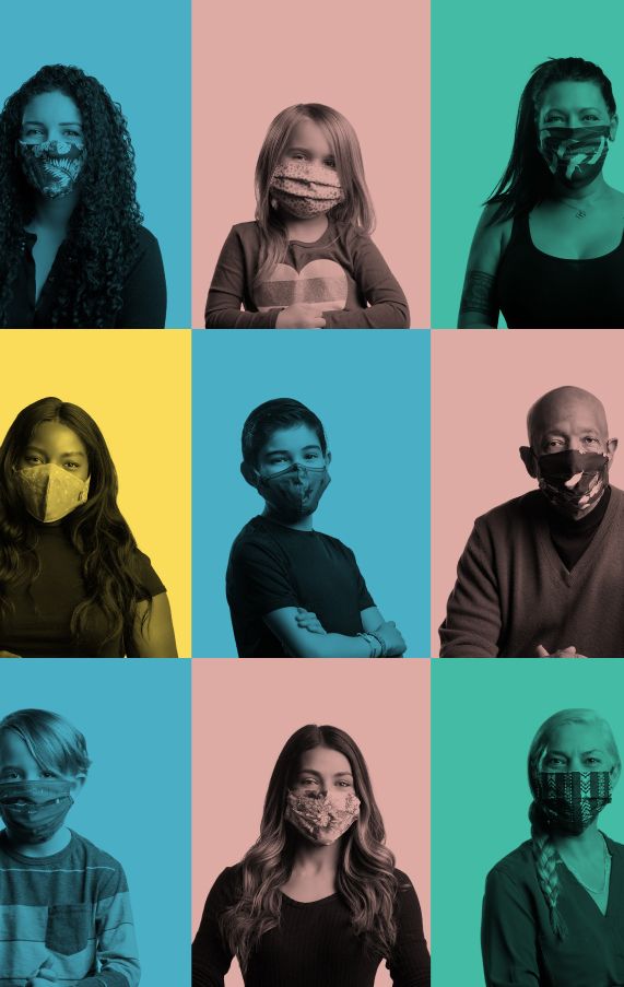
Regional Information Center
Mask On and Move Forward, Together
peep it


Blackbird
Accessible Cannabis Before It was Cool
peep it


Davidson Institute
Lighting the Way for Bright Young Minds
peep it


NCJFCJ
PR Plan: Marked as Evidence
peep it
You're in good company


Close to home


Partnering with portfolio brands that demand results