ADSD
A State Agency Brand With a Human Touch
When rebranding the Nevada Aging and Disability Services Division (ADSD), we set out to better tell their story and, in turn, connect more Nevadans to their resources. By honing in on what sets ADSD apart, we helped them become more than a government acronym—we made them feel like a trusted ally.
People are at the heart of everything
The Nevada Aging and Disability Services Division (ADSD) supports some of the state’s most vital communities: older adults, people with disabilities, and their families. Yet there was a disconnect between this agency and the people it exists to serve. Common questions included, “What is ADSD”, “Who do they serve?” and “How do they prioritize their audiences?”
The rebrand brought clarity to the division’s brand, unity to its voice, and a deeply human vibe. Everything was designed to reflect ADSD’s undeniable dedication. More than that, all elements are geared towards helping those in need feel heard.
Insight-driven from the inside out
We kicked things off by talking to the people who are boots on the ground at ADSD. That meant a full-day workshop with key stakeholders, seven in-depth interviews with program leads, and many conversations with community partners.
Then, we did our own research… a lot of it. Over 50 internal documents and resources reviewed, 12 peer organizations analyzed, and secondary research conducted—all to see how ADSD stacks up. To round it out, we led a statewide awareness study to find out what Nevadans know about ADSD.
All of these efforts helped us build a brand that not only addressed pain points, but that is backed by data.
Defining their top three audiences
ADSD supports Nevadans across nearly every stage of life, which meant their messaging needed to be expansive without becoming diluted.
- Primary: People in need of aging and disability services as well as their care partners
- Secondary: Healthcare professionals, counselors, and early intervention specialists who rely on ADSD to help connect their clients with resources quickly and efficiently
- Tertiary: Community leaders—such as those who work at or with the courts, law enforcement, and nonprofits—who expand ADSD’s reach and need to know what’s available to guide Nevadans to the right place
We developed a system that speaks clearly to each audience while staying rooted in the division’s mission of providing support that improves Nevadans’ quality of life.
Every element reflects the brand foundation
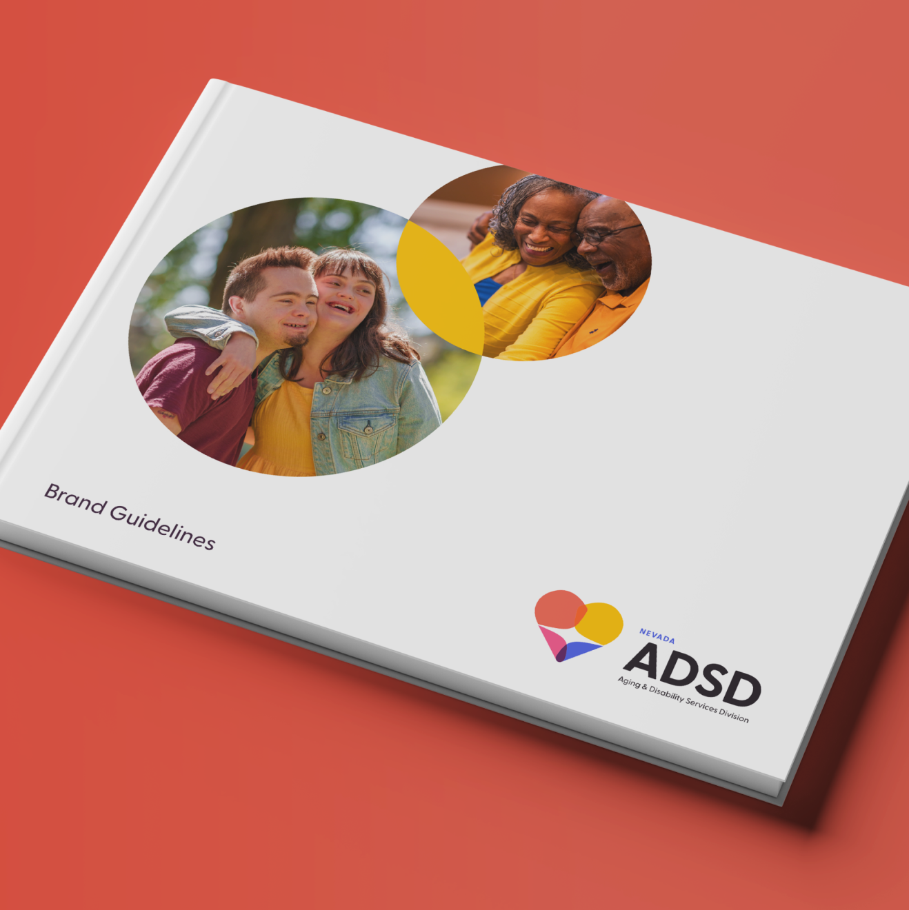
To start, we dialed in the brand foundation, including mission and vision statements, core values, brand archetype, and their very own persona. These elements shaped every decision in the verbal and visual identities while also making it easy to rally the stakeholders around.
One of the most important pieces was the creation of ADSD’s “why”—ADSD believes that all Nevadans deserve to lead meaningful, independent lives—which served as our north star throughout brand development.
Verbal identity
ADSD’s brand voice sounds understanding, empowering, and hopeful. We built voice principles and specific brand tones for each of the division’s core audiences, so ADSD’s staff could adapt messaging in a way that truly resonates.
Persona
When writing branded content, sometimes it helps to have a character or persona in mind.
For ADSD, who better than Mr. Rogers? He was the picture-perfect neighbor and community member due to his empathetic and kind demeanor. Mr. Rogers easily made connections with people and brought a unique approach to communicating complex ideas to children and adults alike.
Visual identity
Visually, the brand is warm, vibrant, and inviting. The heart-shaped logo doubles as a pair of embracing figures—a design that’s reflective of the very work ADSD does to support Nevadans.
Every design element was built to be beautiful, accessible, and rooted in real-world utility. The flexible color system allows for individual programs to stand out while still feeling like part of the whole, creating cohesion across a wide-reaching division.
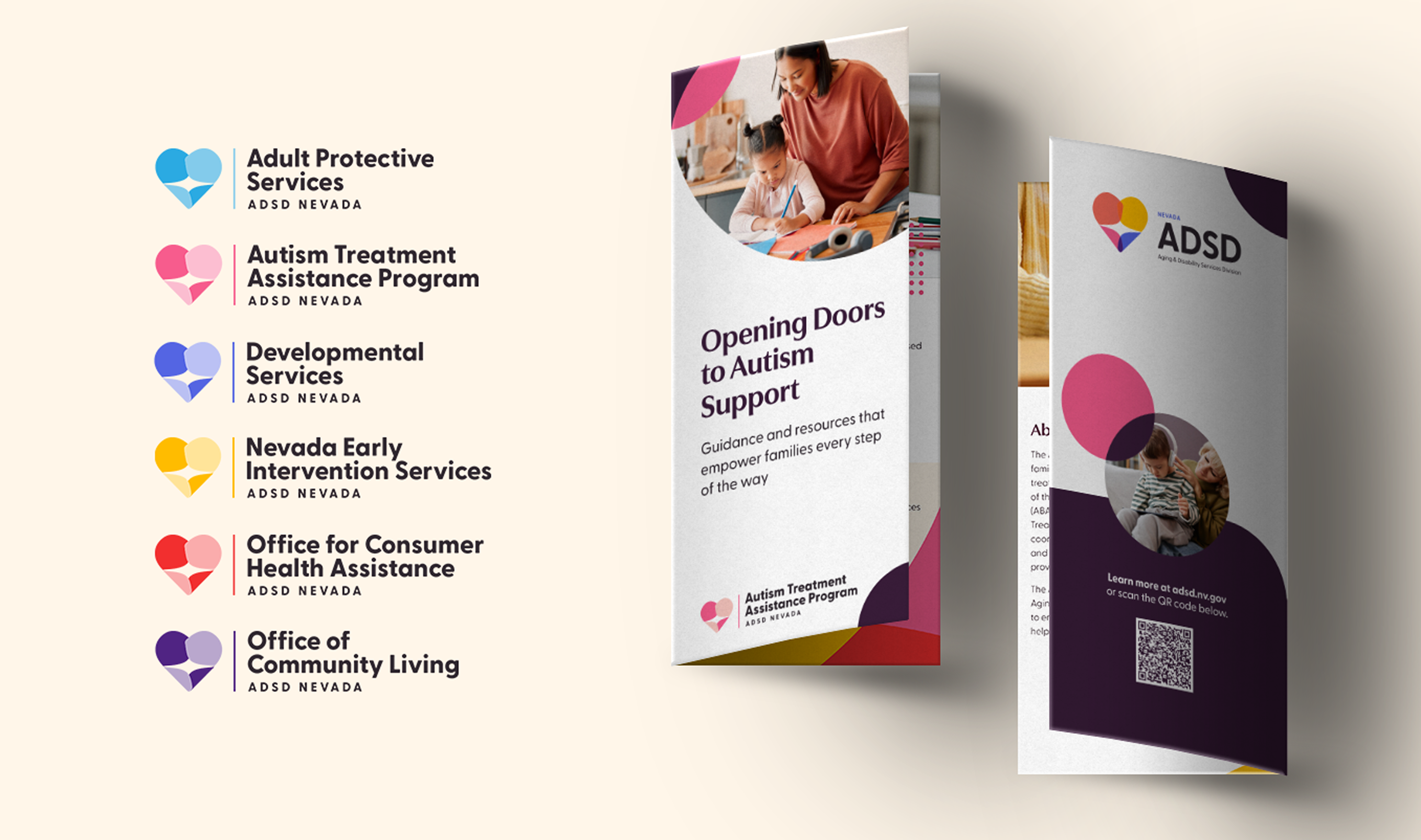
Brand hierarchy & program identities
This rebrand extended to ADSD’s programs while honoring each of their service areas. That’s where their sub-brand hierarchy comes into play.
Programs have their own color and logo lockup that visually connects back to the larger ADSD identity. This approach builds trust and recognition across the board, no matter if someone is introduced to the larger ADSD network through Adult Protective Services, Nevada Early Intervention Services, or another program.
This hierarchical system ensures ADSD is the main brand. Additionally, it provides internal teams a practical framework to follow, to make it easy for staff to see how each program fits into the larger picture.
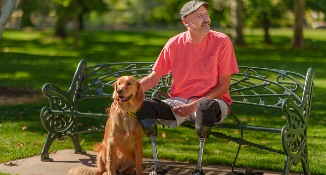
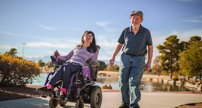
Photo & video library
ADSD didn’t have an asset library that represented the people they served, giving us an opportunity to build one with custom photoshoots. These images demonstrate uplifting scenes of older adults, individuals with disabilities, care partners, and the dedicated professionals who support them.
Photoshoots took place in Reno and Las Vegas, capturing the full spectrum of this organization’s reach.
Additionally, we filmed interviews with several ADSD stakeholders, team members, and community members. Their perspectives and lived experiences brought heart and humanity to a new set of campaign videos. (More on that soon.)
Putting the brand to work
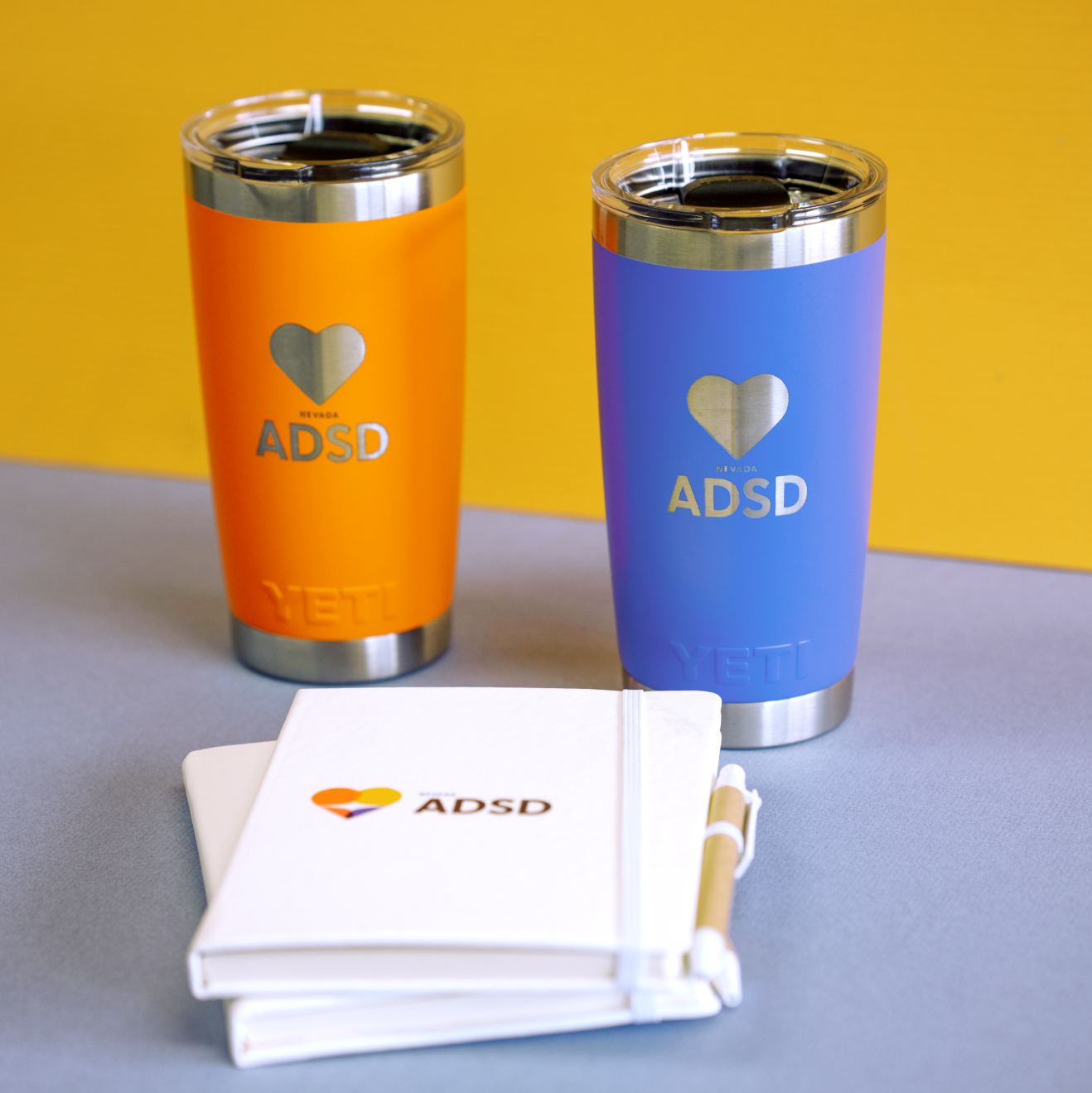
Once the new brand foundation was set, we made sure ADSD’s new identity could be seen, felt, and used everywhere, from printed brochures to the homepage.
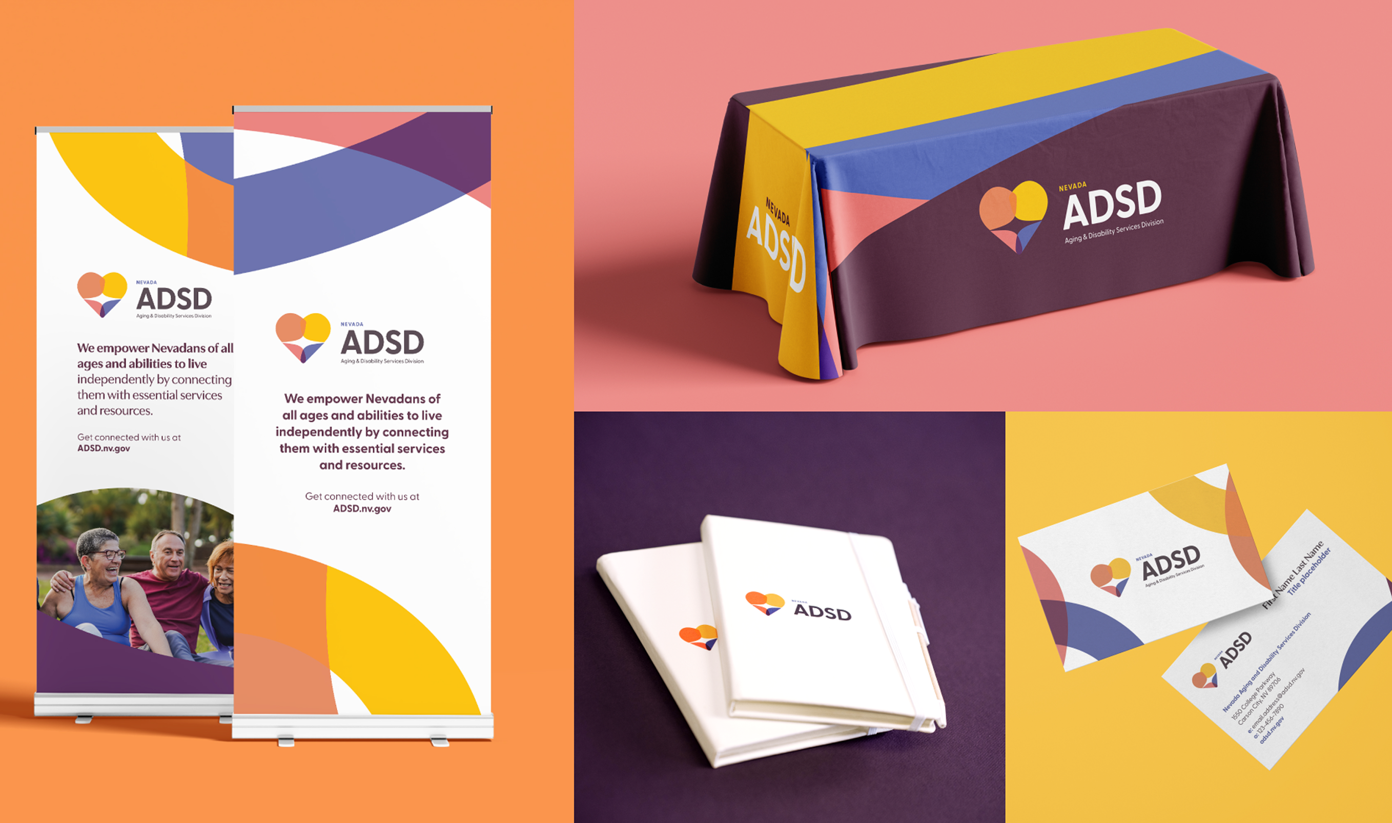
Marketing collateral
Alongside the brand and messaging guides, a full suite of collateral materials were developed to help ADSD’s team stay on-brand as they hit the ground running:
- Brochures
- Business cards
- Event banners
- Tablecloths
- Canva templates
Internal staff also have access to practical tools like letterhead, presentation templates, and email signatures.
Where the brand meets the community
Creating a strong brand is one thing. Making sure it resonates with the people it’s built to serve—now that’s the real test. Once ADSD’s refreshed identity was ready to shine, it was time to bring it to their primary audience.
Ad campaign
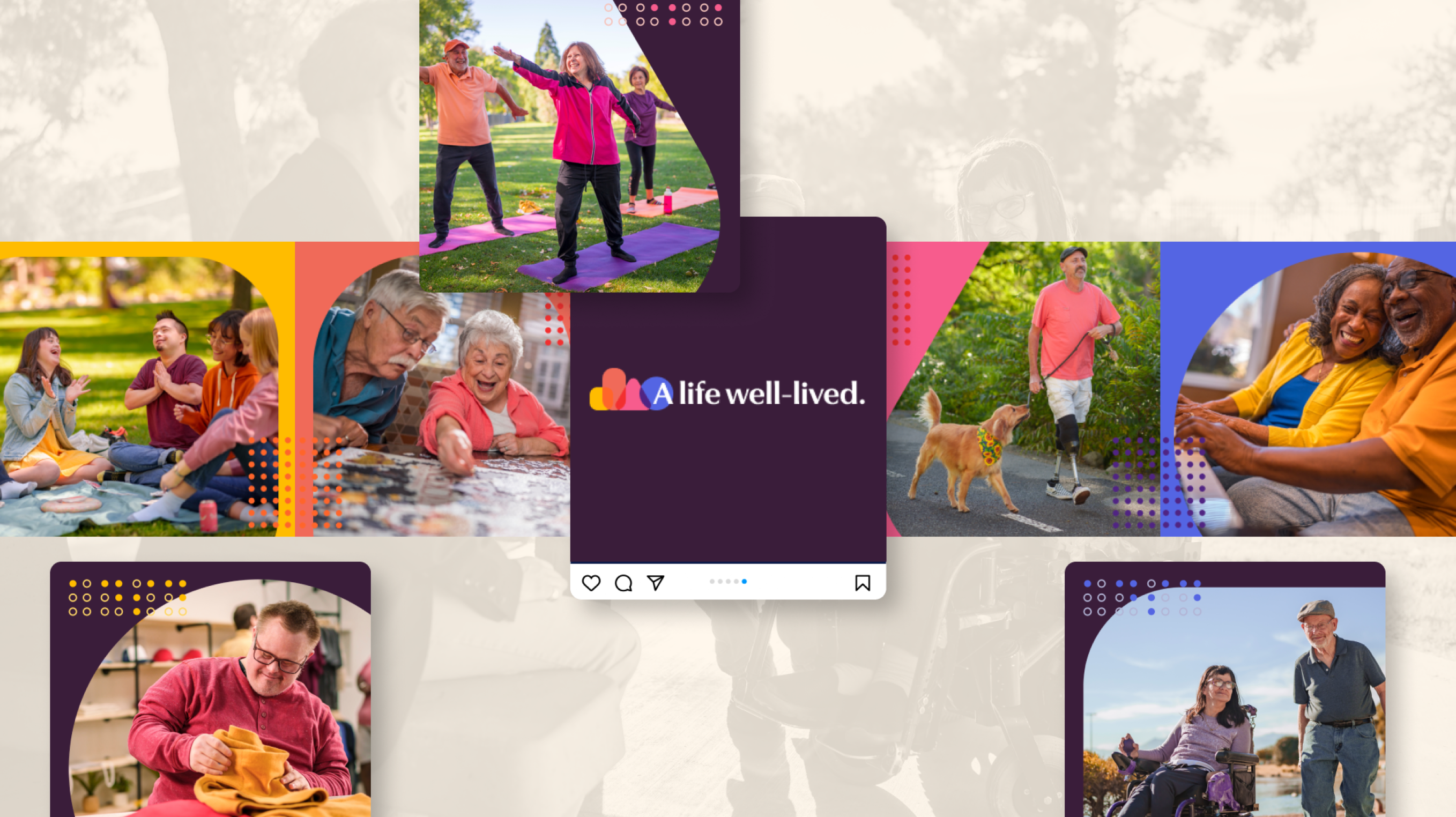
To bring the brand beyond ADSD’s walls and into the hearts of Nevadans, we launched an awareness campaign rooted in empathy and empowerment. The concept highlighted everyday moments that define a life well-lived.
We built a multi-platform media plan—from Meta to rural news outlets—that meet people where they are. The creative mix included static and carousel ads, and videos.
Social media
As we planned for ADSD’s launch, social media became a key player in introducing the reimagined brand. A strong, consistent presence on these platforms will give people a sense of the work ADSD does, highlight the real impact of our services, and build trust.
Takeaways from a social media audit informed a new social media strategy focused on connection, accessibility, and education. Once approved, 20+ evergreen posts were written, each demonstrating how the brand tone flexes and how to speak about specific programs.
Focus groups
Listening is the first step to solving our main audience’s pain points. We hosted four in-person focus groups—two in Reno and two in Las Vegas—bringing together members of two key communities: deaf and hard of hearing as well as blind and low-vision.
These conversations focused on creating a more accessible and empowering digital experience in the future. Their feedback will become the foundation for the future ADSD website.
Planning for a seamless, statewide rollout
To make the brand launch as smooth as possible, a rollout plan was built with timelines, priorities, communications cascade for various audiences, and plenty of checkpoints. We also wrote launch emails that introduced these changes to ADSD’s internal team and key stakeholders, using messaging that got people excited and in the loop from the jump.
There were two elements during the launch phase that were particularly special:
- Brand training videos that could stand the test of time and easily onboard such a large team
- Multiple unveilings at their offices across the state to hype up their employees, complete with branded outreach materials
Long story short
When a brand reflects the passion of its employees and the people it serves, it becomes more than a logo—it’s a lifeline. Like Mr. Rogers, ADSD now feels like the friendly neighbor that Nevadans can count on.
Brought to you by...
Sarah Polito
Ryan Sullivan
Jenna Atwater
Shyene Joubert
Kyla Hutchison
Isabel Williams
Vin Gonzalez
Julia Jones
Montana Routsis
Sara Robbins
Elaine Morrison
Liz Seang
Logan Schauer
Nicole Shearer
Olive Giner
Kacey Fowler
More awareness, more impact
The goal was never just a new look—it was to help more people connect to services when they need them. With a more welcoming voice, thoughtful design, and clearer messaging, ADSD’s rebrand made it easier for Nevadans to recognize the division as a trusted resource.


Our starting point: the brand foundation
Having a solid brand foundation made sure we could hit the ground running. We captured ADSD’s purpose in all facets of their new brand, including mission and vision statements, persona, voice and tone, and visual identity.


Inspiring a life well-lived
ADSD connects Nevadans to a network of services that have the power to let Nevadans live life on their terms. We celebrated how empowering this division was while reintroducing it to the general public through an awareness campaign.

Programs connected by purpose
ADSD is made up of seven unique programs, each offering vital services to Nevadans. We created a clear brand hierarchy to show that while each program has its own focus, they’re all part of one unified mission.

Materials showing the brand in action
Rebrands = a whole new suite of branded materials. Banners, business cards, letterhead, templates—you name it. All of these helped the ADSD team to show up prepared and on-brand, wherever they go.

The path to a smooth rollout
Big launches mean smart planning. We crafted a plan, launched hype emails, and produced bite-sized training videos, so the division’s statewide team could really own the new brand.
Creating a lasting impression
When a brand reflects the passion of its employees and the people it serves, it becomes more than a logo—it’s a lifeline. Like Mr. Rogers, ADSD now feels like the friendly neighbor that Nevadans can count on.


